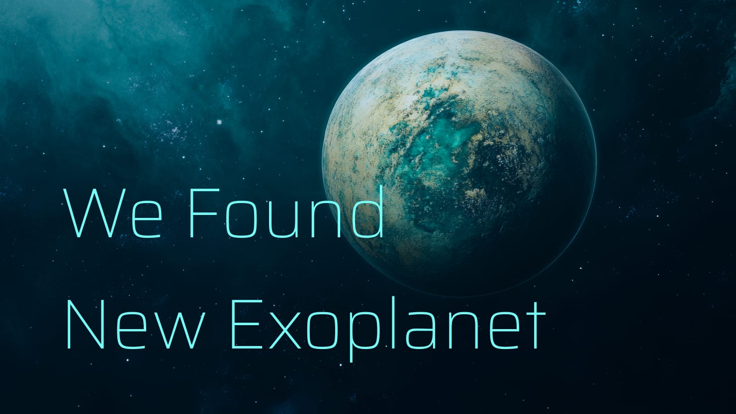
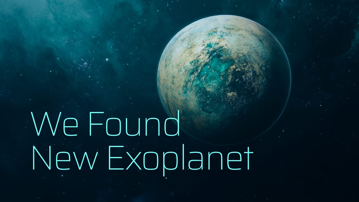
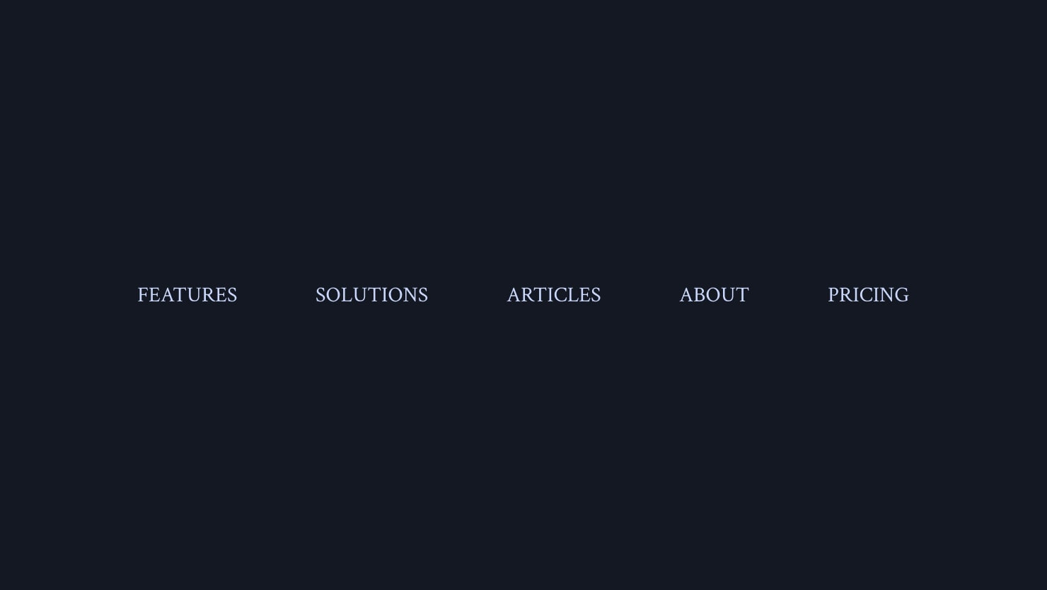
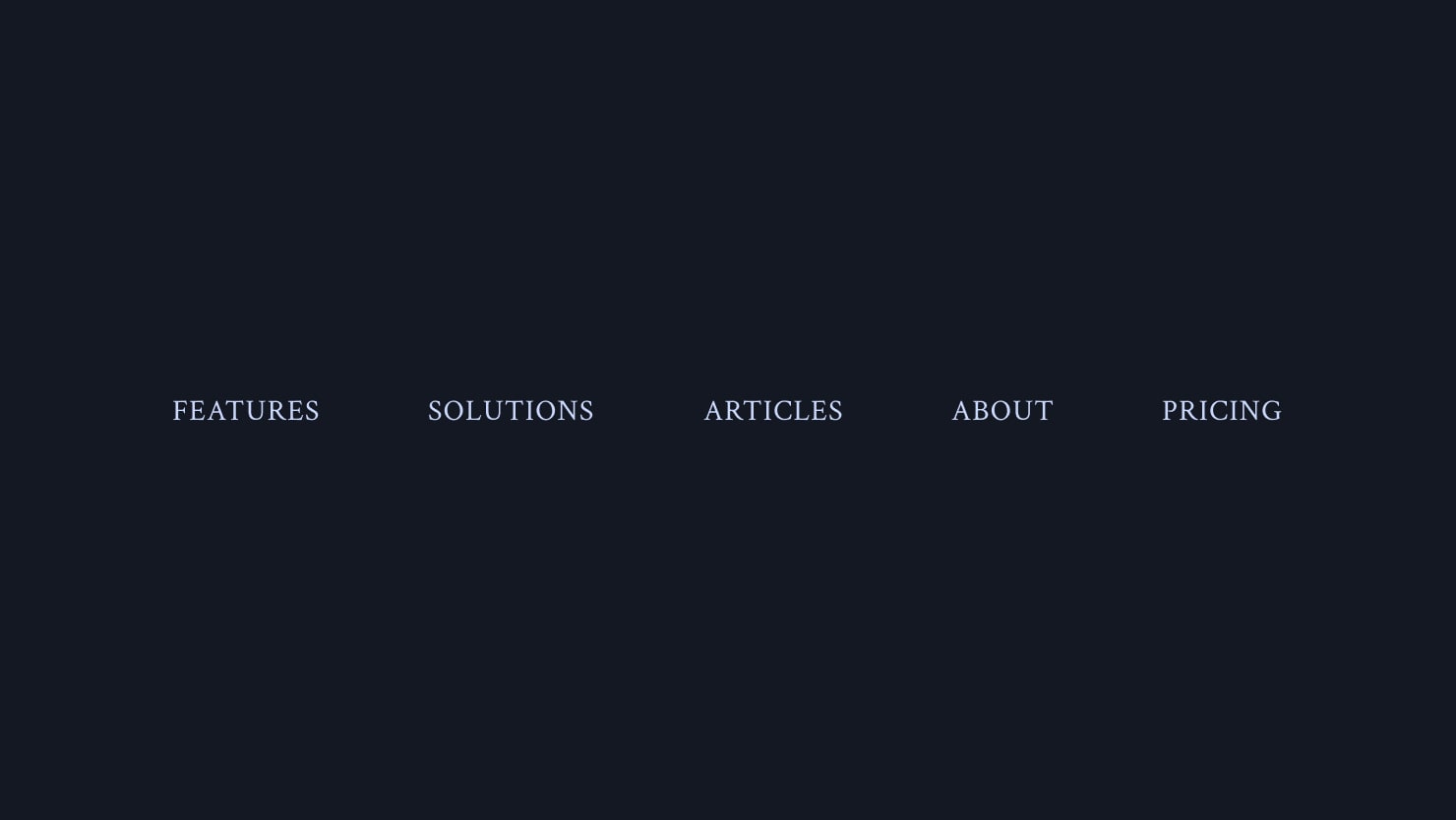
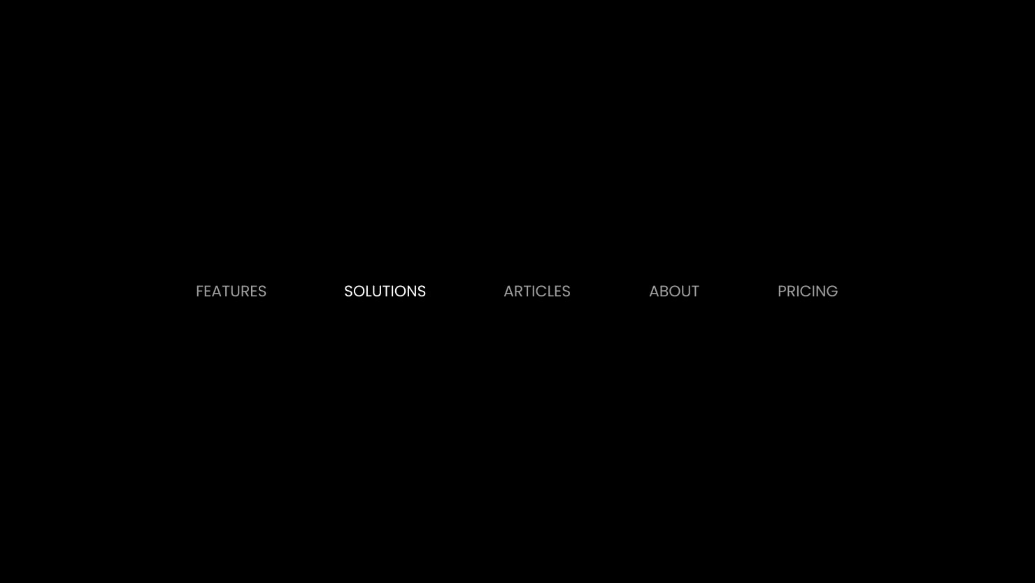
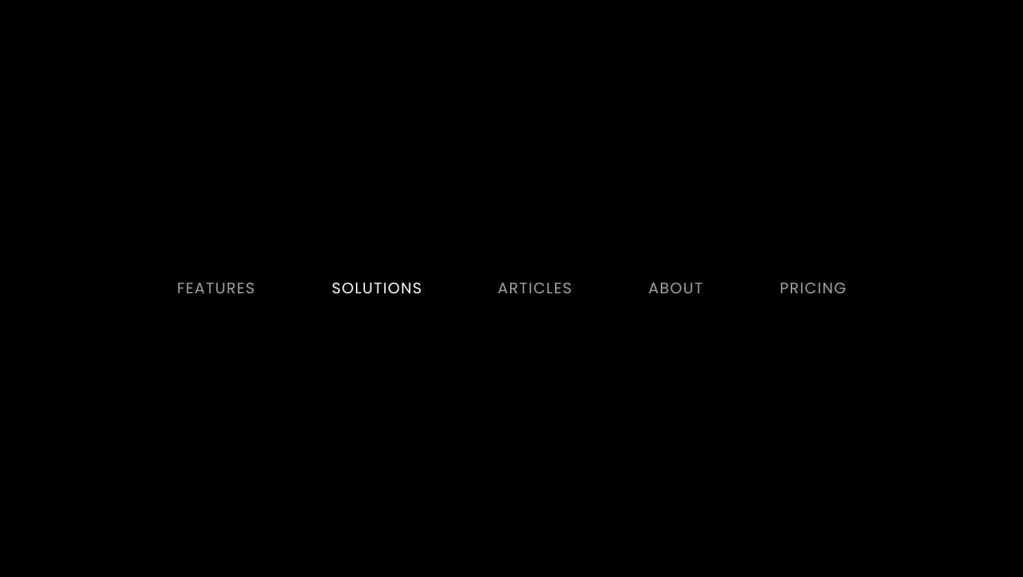
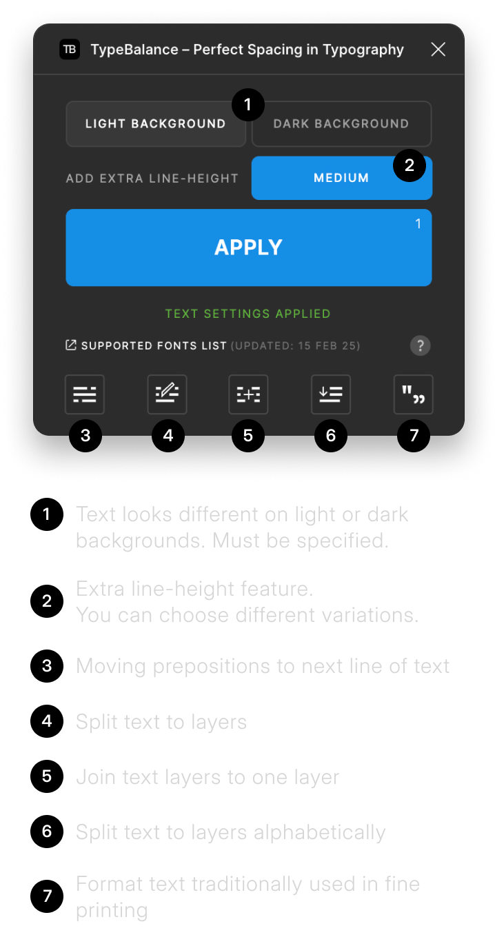
Apply different settings on dark and light backgrounds
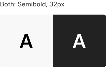
On light background text appears thinner. On dark background text looks bolder. This is an optical illusion effect.
Our plugin applies the best settings taking this effect into account.
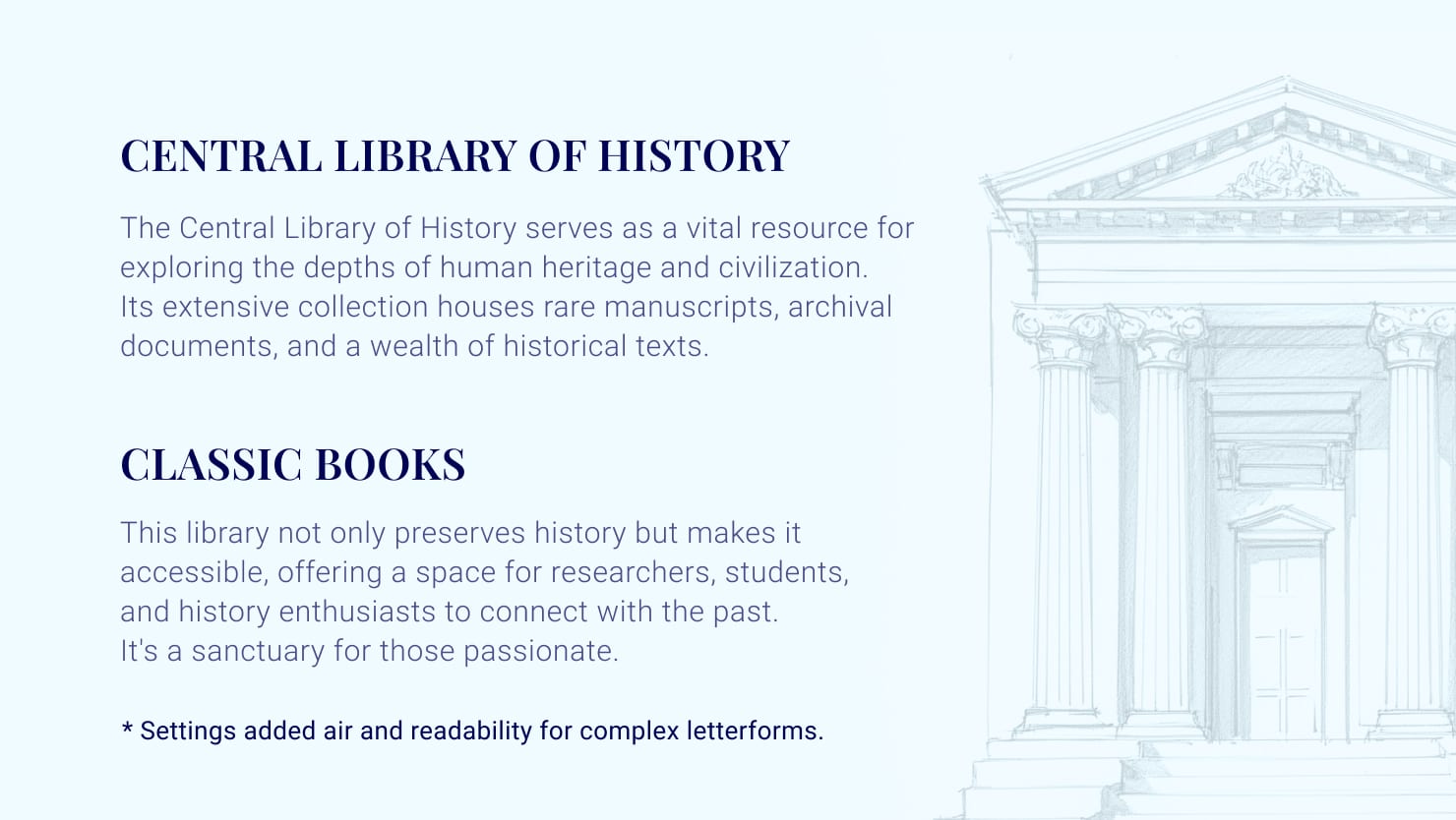
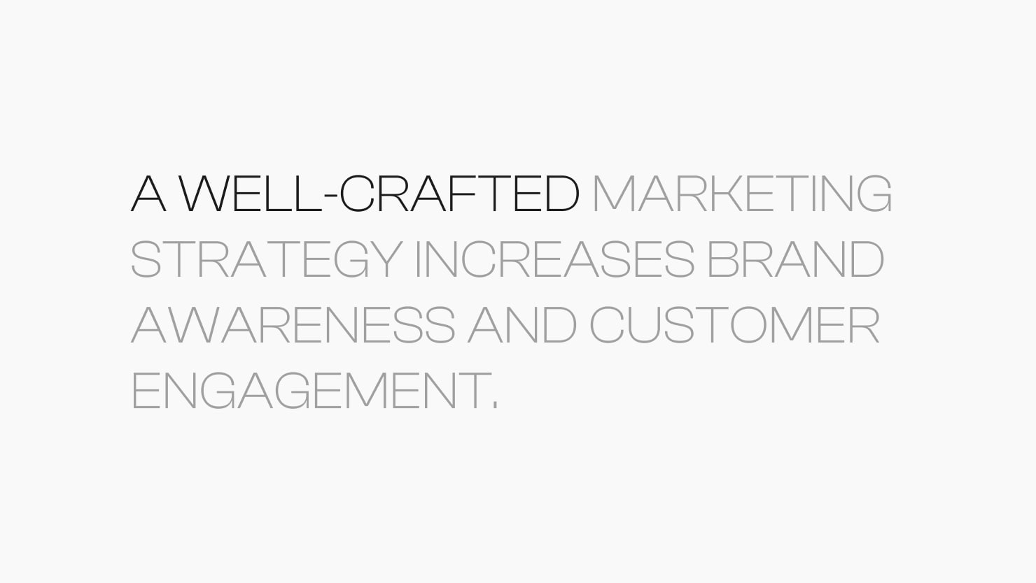
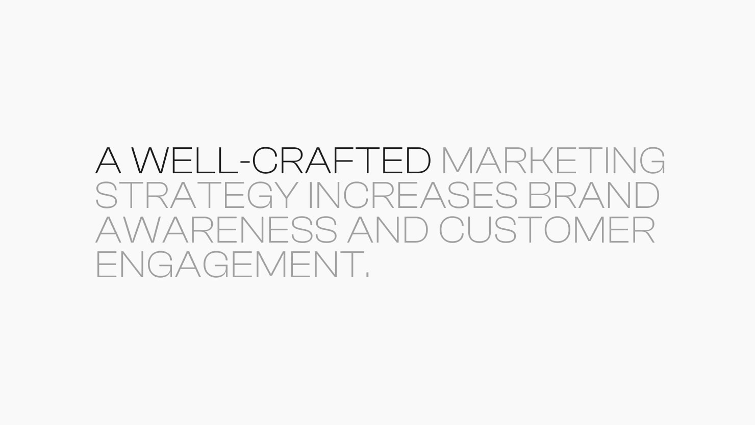
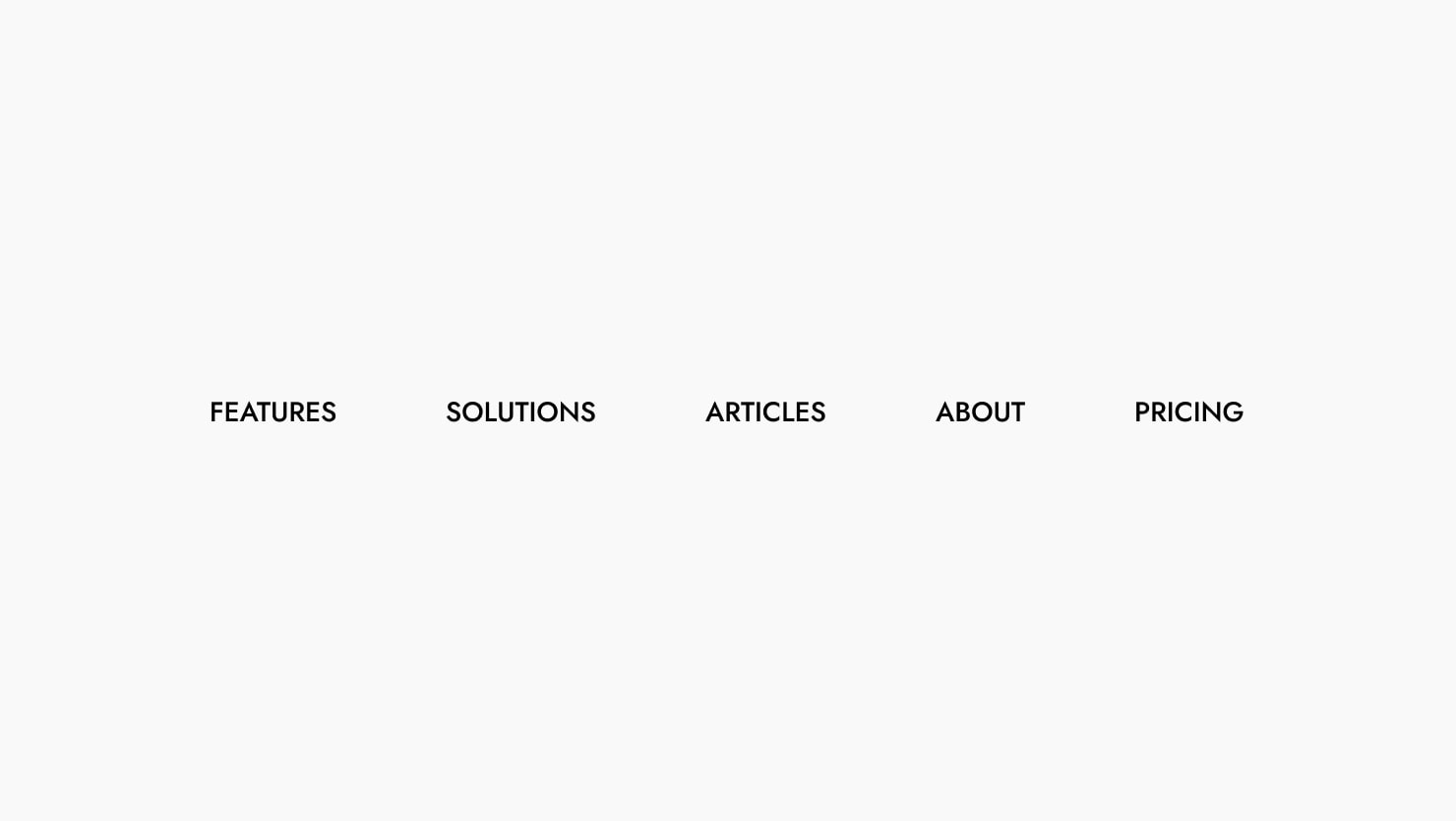
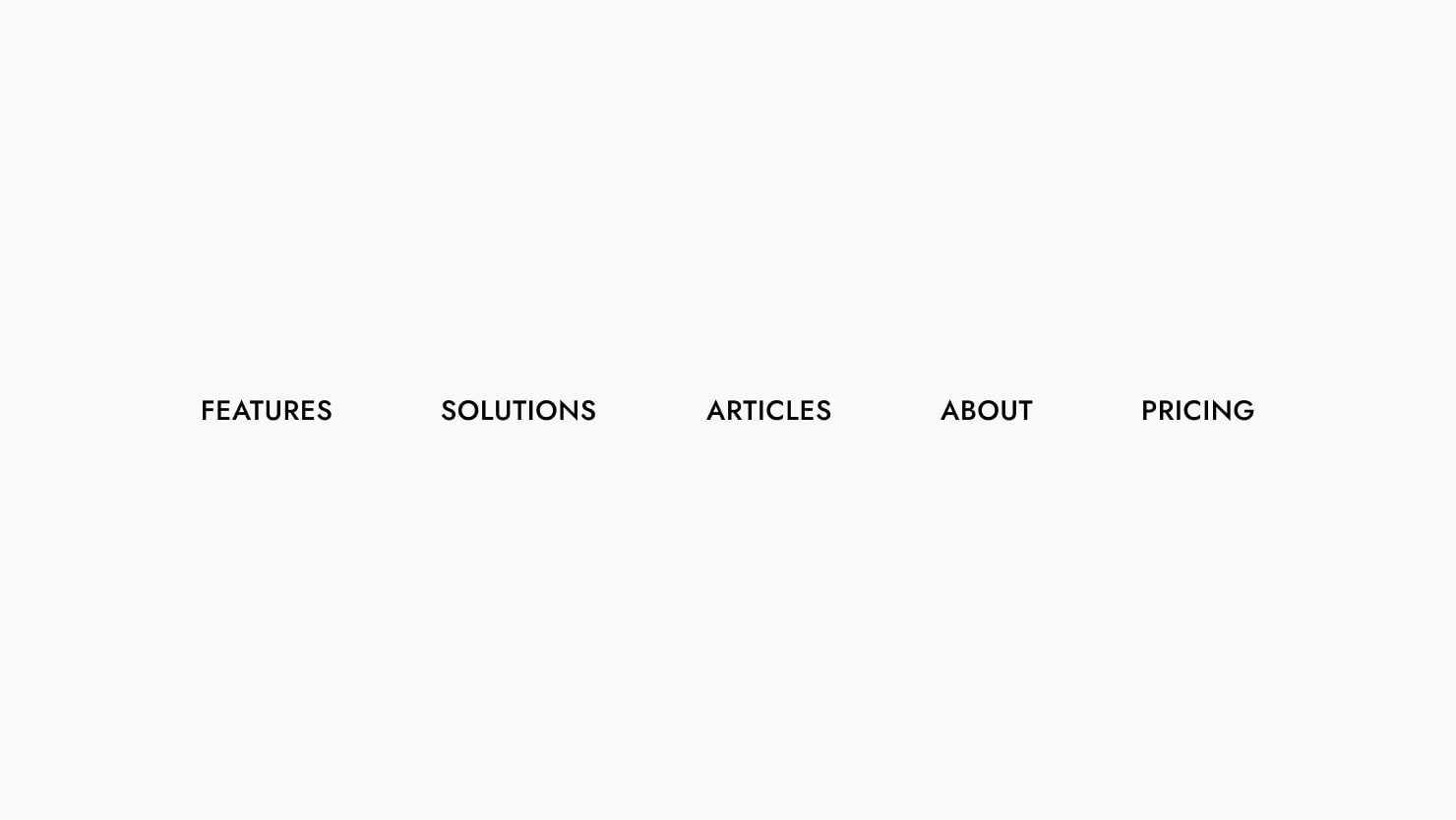
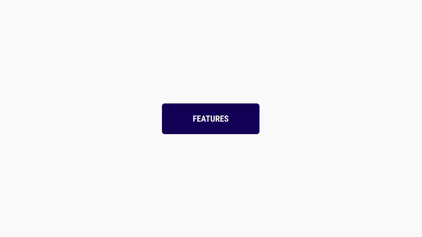
Uppercase text fine-tuned to look better and readable
We analyzed many examples with uppercase headings, links, and buttons. After that we noticed that uppercase looks different because forms of letters are bigger and longer.
We found the best settings for this type of text!
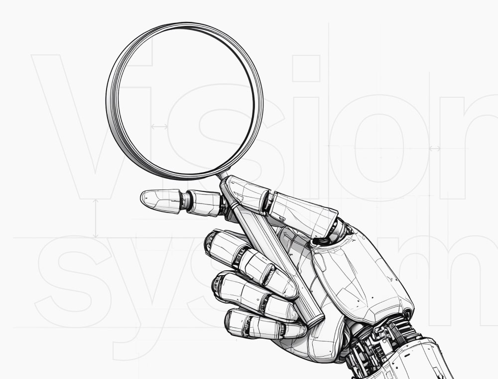
We are using ML algorithms in adding settings process
Our computer vision system selected optimal settings for the supported fonts in the database. These settings were then adjusted, corrected, and tested.
This is collaboration at its best!
Helpful tutorials to get the best results
We’re here to help! We show recommendations and samples.
I can't find font in database. How I can suggest font?
You can send font names in our community. We will be adding the font to our database within a week and you can check adding status on your post page.
Why plugin not apply settings to Italic fonts?
Italic fonts are harder to perceive. In an era where user experience and readability are the priority, straight and easily recognizable fonts have become preferable. We may include some italic fonts in the future.
What font sizes are supported?
We support sizes in pixels, from 8px to 210px to be exact. This is sufficient for any digital product.
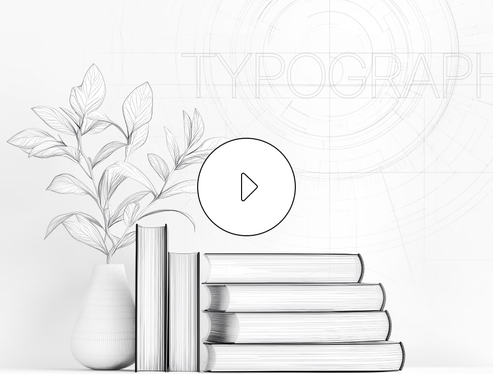
Where I can view full before/after samples?
You can take a look at the full size layouts in this Figma File.
We plan to introduce a monthly fee after we are sure that the plugin really helps designers and benefits them.
Who developed this plugin?
We are a team from Kazakhstan.
Dmitriy Vaganov
ML and Project Development
Sabit Sugirov
Coding, Design and Fonts Database Management
The idea for the project came to mind when it became apparent that setting typography parameters took a very long time. We hope you’ll enjoy our product!