
The Invisible Art: How Letter-spacing and Line-height Shape Our Reading Experience
Typography might seem like the quiet cousin in the design family—not as flashy as color schemes or as immediately noticeable as images. But within this subtle art, letter-spacing and line-height work like secret agents, powerfully influencing how we read, feel, and understand content without drawing attention to themselves.
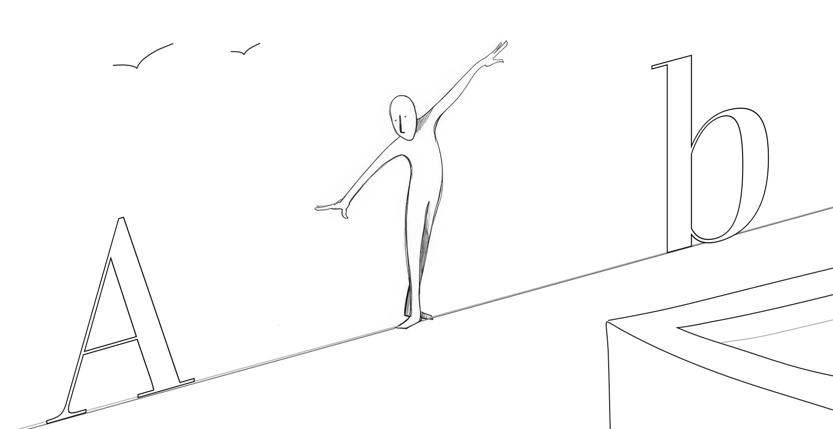
Letter-spacing: The Breathing Room Between Characters
Letter-spacing (also known as tracking) is all about the space between individual characters in text. Getting this right can be the difference between text that flows naturally and text that feels cramped or awkwardly spread out.
When letters have adequate spacing, our eyes can more easily distinguish individual characters. This is especially important in smaller text sizes where characters might otherwise blend together. A slight increase in letter-spacing for small text can dramatically improve readability.
On the flip side, luxury brands often use increased letter-spacing in their logos and headlines to create an air of sophistication and elegance. Just think about fashion magazines or high-end jewelry advertisements—that extra breathing room between letters conveys exclusivity and refinement.
However, too much spacing can disrupt the natural flow of reading. When characters stand too far apart, words lose their cohesive shape, and our brain has to work harder to process the text as unified words rather than individual letters.
Line-height: The Vertical Rhythm
Line-height (or leading) refers to the vertical space between lines of text. This seemingly simple property can make or break readability, especially in longer passages.
A comfortable line-height creates what designers call “vertical rhythm”—a pleasant, consistent spacing that guides your eyes smoothly from one line to the next. Too little line-height makes text feel dense and claustrophobic, causing eye strain as lines blend together. Too much creates disconnected islands of text, forcing your eyes to work harder to find the next line.
The golden rule for body text? A line-height of about 1.5 times the font size tends to create optimal readability. This isn’t just designer folklore—research has shown that proper spacing improves reading speed, comprehension, and reduces fatigue during extended reading sessions.
The Relationship Between The Two
Letter-spacing and line-height don’t exist in isolation—they dance together. When you adjust one, you often need to reconsider the other:
- Increased letter-spacing might call for slightly increased line-height to maintain balance
- Condensed fonts typically need more line-height to remain readable
- Display text with dramatic letter-spacing adjustments often requires custom line-height to maintain harmony
Why Should You Care?
Even if you’re not a designer, understanding these principles can help you:
- Make your work documents more readable
- Create more effective presentations
- Choose better fonts for your personal projects
- Appreciate the subtle craft behind well-designed books, websites, and products
Next time you find yourself easily reading a book for hours or struggling through a poorly formatted document, pay attention to these invisible elements. The difference between strain and ease often comes down to these seemingly minor spacing decisions.
The best typography is paradoxically both invisible and powerful — it shapes our experience without calling attention to itself.
Now that you know what to look for, you’ll start noticing these details everywhere!